9.28.2007

New Jersey(s) ... Part V

The season gets under way tomorrow afternoon, so I think I had better finish these uni critiques now.

First, I want to announce the second annual steak dinner bet with Gurnee-based blogstatician and lunatic marathoner Christopher Marvin Altruda.

To refresh your memories, gentle readers, last year’s bet resulted in dinner at the Chicago Chop House … and me forever cursing defenseman Lasse Kukonnen, then with the Blackhawks, now in Philadelphia.

The bet was this: I said the Blackhawks wouldn’t win six games in the first six weeks of the season. If they did, I would be on the hook for the check, After six games, Chicago was off to a 4-2 start, but these are the Blackhawks – now free from the clutches of Bill Wirtz, praise God – and it would be possible for them to go on a long losing streak.

As if on cue, the ‘Hawks went 0-7-1 in a three-week span and managed only 11 goals. It looked like I would be enjoying a free dinner. After beating St. Louis for their fifth win, the ‘Hawks played host to Columbus. Surely, Chicago could lose.

Though they were outshot 28-19, Kukonnen scored midway through the second period and Nikolai Khabibulin made it stick. Blackhawks 1, Blue Jackets 0.

Shockingly, Altruda and I have agreed on one thing this season: the Phoenix Coyotes will be the worst team in the Western Conference. All you need to do is look at that roster and ask who’s scoring – Steve Reinprecht? Daniel Carcillo? Daniel Winnik? – and that the goaltenders will be a combination of Alex Auld, David Aebischer and Mikael Tellqvist.

So, the number to watch for with them will be 62. If they finish the season with fewer than 62 points, I will enjoy a dinner at Morton’s. More than 62, Altruda goes for the surf-and-turf.

Now, back to the uniforms …

DALLAS STARS – B: Before this season, the Stars had one of the most unique uniforms of all time with the striping forming a star, but in this new Reebok-ified age, that apparently was impossible to duplicate.

The road whites clearly are the better ones. Cleanly designed, with none of that insipid apron striping on the front, it’s a sweet look. As for the home blacks – that’s right, no longer the home greens – it will take some getting used to.

With ‘DALLAS” and the player’s number taking the front of the jersey, it’s clearly a nod to some college programs. The use of a wordmark rather than a logo is not new: it’s worked quite well for the New York Rangers for decades, the Pittsburgh Penguins did the same for a while as did the Colorado Avalanche with their third jerseys.

Not horrible, just different.

NEW YORK RANGERS – B+: As a die-hard fan, even here in Chicago, I am glad to see that no radical design changes were made here, save one.

Right now, as I am waiting for my laundry to dry, I am wearing a New York Rangers player T-shirt (bonus points if you can guess who’s name and number is on the back – STATS, LLC employees not eligible), and the wordmark essentially goes from 10 o’clock to 4 o’clock.

If you look at these new duds, the wordmark is more – what would you call it … vertical? Seems to go from 11 o’clock to 5 o’clock. A subtle change, and again not horrible, but hockey fans are used to tradition and change is not always welcome.

CHICAGO BLACKHAWKS – A: The best thing about this 1) Nothing’s changed and 2) there won’t be a black third jersey at least for this season.

Though some consider the use of a native American’s profile insensitive, this truly is on the of the classic looks in the league. With the recent passing of longtime tightwad … er, owner … Bill Wirtz, I hope the ‘Hawks now take the opportunity to move the franchise into the 21st Century and back into relevancy in this city.

Just don’t change the uniforms.

MINNESOTA WILD – A-: Since hockey returned to the Northland, the Wild have taken great pains to please their fans. The St. Paul Civic Center, where I used to watch the IHL’s Moose years ago, was transformed into a gleaming jewel known as the Xcel Energy Center and enjoys continual sellouts.

The uniforms were wonderful from the moment they were unveiled. Gone though are the home greens, replaced by their third jerseys. The reds were always seen as the most popular of the three. I like them, but I don’t see the uproar. Nice crest, sure, but I would have preferred the dark green body instead.

If they can only find a way to Marian Gaborik on the ice for more than 50 games a season. Wishful thinking, I know.

ANAHEIM DUCKS – C: No, sir. I don’t like it.

Last season, the Ducks got rid of the Disney duds for a more classic look, and it worked: Anaheim became the first Stanley Cup winner from California. The striping, though, is bizarre, and with the new Reebok template, it looks like the wordmark got smaller.

Don’t get me wrong – I am glad the era of jade and eggplant are gone – but this has swung completely the other way. Perhaps there can be a common ground by 2008-09.

BUFFALO SABRES – B-: Like the Ducks, the Sabres introduced this new look last season … and thus was born the “Buffaslug.”

Look at it one way, it’s a slug. Look at it another way, it’s Barney Rubble’s hair. They’re not horrible, but they don’t really scream, “Holy shit, these suck” either. Since teams like the Rangers, Blackhawks and Canadiens were able to retain their identities with these new unis, longtime Sabres fans would be salivating to see the round logo with the charging Buffalo and crossed swords come back full-time.

A wonderful idea sure, but how else will they pay Thomas Vanek $50 million over seven years outside of merchandise sales?

EDMONTON OILERS – D: Oh, no.

No. No. No. No. No.

Stripes on the inside of the sleeves? Bad. Apron-string piping? Bad. Removal of the secondary logo of the oil worker? Bad.

OK – something good? The main logo didn’t change. Other than that … FEH!

NEW JERSEY DEVILS – A: I’m indifferent when it comes to this team. I like that they’re moving from the swamps of East Rutherford to revitalized Newark.

I like that they pretty much left the uniform alone. No logo or color changes to go with the new building. Another case of leaving well enough alone.

TORONTO MAPLE LEAFS – A: See above. No bells. No whistles. No issues.

Now, wins a Stanley Cup for the first time since 1967.

9.12.2007

New Jersey(s) IV

Like a bad Star Trek movie sequel ... we continue with post No. 200.

NASHVILLE PREDATORS – D: After a 108-point season in 2006-07, this is a team in turmoil.

Canadian carpetbagger Jim Balsillie – rebuffed in his attempt to buy the Penguins – tried to buy the Preds and hijack them to Hamilton, Ontario. Vokoun. Kariya. Timonen. Forsberg. All gone, off too Miami, St. Louis, Philadelphia … and possible retirement.

This team has a chance to be one of the league’s worst – and they’ll be dressed like one of them. Despite the insipid piping, I can deal with the home blues. The road whites, though – why Nashville across the top in letters so small that you’d think you were taking an eye test at the DMV?

But wait, readers may say, ‘You liked it when Vancouver did it. What’s the difference?’ With the Canucks, there was an element of history there from the old WHL teams. The Predators barely have a history, as this will be their 10th season.

Oh, yellow piping on a white jersey? Nice choice … as I roll one eye in the back of my head.

PITTSBURGH PENGUINS – A-: Having lived in the ‘Burgh for a year, I can tell you that the residents of that dump have an unhealthy obsession with black and gold. Except on Friday nights at PNC Park when the Pirates break out the red Heinz 57 vests.

Let me say this: I don’t care if he runs the bases, sinks the 3 or skates the length of the ice – Jack Lambert no longer plays there. Neither do Jack Ham, Franco Harris and Rocky Bleier. And Mike Webster, Justin Strelczyk and Steve Courson will not be walking out of Primanti’s any time soon.

With that, I am glad to see that Penguins resisted the opportunity to change the current Vegas Gold back to the French’s mustard yellow that Lemieux and Jagr wore back in the day when they won back-to-back Stanley Cups. To me, it means that they want to continue carving out their own identity with the likes of Crosby, Malkin and Staal and with a slight nod to city’s other great teams.

Keeping the skating penguin – very cool, too.

DETROIT RED WINGS – A: Once again – simple and classic are GOOD. No changes to the winged wheel. No addition of black or silver as an “accent color.”

The only thing that keeps this from being and A+ is that the ‘C’ and ‘A’ for the captain and assistant will be on the upper left side – it will be different and odd, but they could have done far, far worse.

9.10.2007

More New Jersey(s)

And we continue …

NEW YORK ISLANDERS -- C+: OK … some will say that I am biased because of my unabashed hatred for the “Icelanders,” way out on the farms of Long Island. And, to a degree, that’s true.

I think orange has become the new black in pro sports – look at the Cincinnati Bengals and Golden State Warriors for example. The orange sleeves, here are overkill. The numbers on the back could easily be seen from the Northern State Parkway.

Another drawback, though not seen here, is uniform numbers will be on the front to the upper left side of the logo, around 10 o’clock, along with sleeve numbers. I don’t know why. Looks silly to me.

If I needed to pick one good thing, it’s another nod to history: they kept the four stripes on the shoulder for their four consecutive Stanley Cups. Bastards.

But man, all that orange.

LOS ANGELES KINGS – B: Meh.

No huge changes here, but the lower half of the jersey is cleaner – no striping, no funky designs save for “Los Angeles” being spelled out on the hem, but they’ve been doing that for the last few seasons.

I think that dark jersey looks better, but the contrasting color seems more blue than purple. A metallic purple – the Minnesota Vikings helmet color – would stand out better.

TAMPA BAY LIGHTNING – A-: This is a team that has needed a makeover for years, and they seem to have done well here.

The new font to spell out Tampa Bay is bolder, as is the lightning bolt. Before, it was spelled out in a script that was difficult to read. Like the Islanders, though, they’ll have the number on the front … and that’s a drawback to me.

Overall, a solid job and not much here to bitch about.

FLORIDA PANTHERS – F: Bad. Really, really bad. The thing about these critiques is they’re completely subjective – at first glance, you either love them or hate them.

Hate it, and it took about half a second to come up with that.

That striping on the inside of the sleeves is horrendous, as is the colored sleeve that extends across the top of the back. They may be a better team this season, but they’re going to look like clowns.

9.07.2007

New Jersey(s) -- Part II

The reason I will not be looking at all the new duds NHL teams will be sporting this season is not all of them have been unveiled yet. Some squads will be showing theirs off during training camp – for example, the St. Louis Blues are scheduled on Sept. 15.

So … continuing a look at the new jerseys to be unveiled in 2007-08.

WASHINGTON CAPITALS – A: So, they play a stone’s throw from the White House and for the last decade, or so, the Capitals proudly have worn the black, bronze and blue.

Yeah, doesn’t quite roll off the tongue.

Washington decided to go back to red, white and blue, and – in what seems to be a common theme with a lot of teams – an update look of their classic jerseys. When the Caps first played in 1975-76 (Quick quiz: what other team entered the league as an expansion team that season), they had a wordmark that doubled as their logo.

What’s a wordmark? Exactly what it sounds like: think about the New York Giants helmets when they won their Super Bowls.

Eventually, when teams bring back third jerseys, probably in 2008-09, it’s a safe bet this shoulder patch will be the logo that will be on the front.

Sure, it’s an eagle spreading its majestic wings to form a “W,” but do you also see the outline of the Capitol? And to think their two best players are Russians.

(Quiz answer: Kansas City Scouts)

CALGARY FLAMES – B: OK … here are the good elements – tie-down on the neck … that they kept the dark jerseys the same; to me the black pops on this one. Those are two things that jump out.

Two things are more subtle – one good, one not so good.

Whenever Calgary and Edmonton play, it’s often referred to as the “Battle of Alberta.” These are two cities that clearly do not like one another. What Calgary has done with their shoulder patch is use the crest of the Alberta flag.

Never mind the blue background – this is absolutely brilliant and unique, and it will tweak the Oilers just a little. After all, Edmonton joined the league in 1979 with the WHA merger. The Flames relocated from Atlanta in 1980.

The not so good? The Flames are one of six Canadian teams in the NHL. Why do the Flames feel the need to use the Canadian flag as a patch?

That will do more the torque off the Oilers. The Canadiens may have something to say about it, as would the Leafs, Senators and Canucks.

The bad? The piping up the sides and back make this look – as someone on a message board remarked – look like fallopian tubes. Have to agree for now, and this is why it doesn’t get a higher grade.

9.06.2007

New Jersey(s)

It’s September … baseball finally is winding down, college and pro football are getting started. And – something I look forward to, anyway – NHL training camps are opening up, and that means I need to start writing on this again.

There are many new names in new places, but one thing that will highlight this season is the introduction of new uniforms for all teams.

Never mind that there are more pressing issues going on – a real television contract that is not shown on the Rodeo Channel, for one. Another would be the league continuing to repair its image following the lockout.

And while I’m on my soapbox, would it be too much to have every team play every other team each season, home and away?

I live in Chicago, but if I want to my beloved New York Rangers this season, I need to drive six hours northwest to St. Paul, Minn., because Central Division teams will not play Atlantic Division teams this season.

Sure. Makes perfect sense.

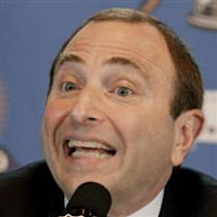
This is an issue that rankles a lot of fans, but – as Gurnee-based blogstatician Chris Altruda calls him – the Keebler Elf (read: commissioner Gary Bettman), it’s far more important to have more streamlined uniforms that, hopefully, will generate new revenue streams.

So, now, I will turn into Mr. Blackwell …

COLUMBUS BLUE JACKETS – GRADE: B+: This one is easy to critique. The team may still be awful, but at least they will look better while struggling.

The biggest change was getting rid of the old CBJ logo with a stick planted in the middle of it for what was the logo on their third jerseys. The Ohio state flag makes a graceful ‘C’, and the shoulder patches feature a Civil War hat.

When the Jackets got started up, their logo included a neon green bug. So people were asking, is a Blue Jacket a bug native to central Ohio? Is the team name honoring Civil War soldiers? WTF is it?? Thankfully, that’s gone.

My big problem with Columbus, though, is it still uses a funky font for their names and numbers.

So I have to ask -- why? That may have been a hook with kids when the team first took the ice, but there's no need for it now six years in.

With a more grown-up look on the front of the jersey, they should have gone traditional on the back as well.

BOSTON BRUINS – A+: Simply put, they got it right.

In recent years, one of the league’s respected franchises wore a more modern (ahem ... uglier…ahem) version of the classic logo with a ridiculous yoke that extended down the entire sleeve. And, let’s not forget the gold Winnie the Pooh third jerseys. Bears, last I checked, evoked fear – unless its name was Yogi or Boo-Boo.

Last year, the Bruins scrapped the WTPs for a classic look that harkened back to the days of Bobby Orr and their last Stanley Cup. While the Cup probably isn’t heading to the Hub anytime soon, this set shows that modernization isn’t always better, and with hockey being perhaps the sport that draws upon its history the most, this set does it well.

Again, showing the coolness of retro, the shoulder patches do more than remind me of Bucyk, Park and Cheevers. Think Clapper. Think Shore.

MONTREAL CANADIENS – A: Again, nothing wrong here.

With all the technological advancements and stretchy fabrics that are going into these jerseys, it’s refreshing to see that history, in some cases, is left intact. The Habs logo hasn’t been changed since … let’s see … forever. Even a third jersey introduced several years ago, was a light colored sweater on a dark template.

No funky fonts, No bells and whistles. Clean and solid.

VANCOUVER CANUCKS – A: One thing about technology is that it will cost you. These new jerseys will set you back about $270, and that doesn’t include a name and number on the back.

If I were to order one of these jerseys, this probably would be the one.

On some logo message boards, this set was met with howls of derision. While there is a lot here, I think it all works together. First, the blue-and-green is back: the colors the Canucks wore when they first entered the league 37 years ago. Second, the classic stick-in-rink logo is on the shoulders and also will be on the pants. Third, the Orca logo in the middle even looks better on this set than it did on the dark blues or the ….shudder … gradient thirds they once wore.

The best part: Vancouver, prominently displayed and again, a nod to history. The Canucks of the old Western Hockey League sported that, and the Millionaires some 100 years ago had the city name spelled out in a block “V”.

Since $270+ is a little steep, I have a $24 blue Canucks T-shirt on backorder.

That’s all for now. What do you think? I’d like to know.