Happy 100th!
Wow ... 100 posts ... and it only took me, what, a year and a half to do it?
OK ... this needs to be written. Who's been designing hockey jerseys lately?
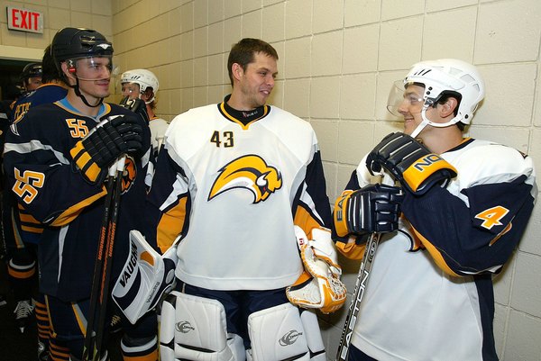
Above, dear reader, is the latest from the Buffalo Sabres. They did something right -- the blue-and-gold scheme was brought back, evoking the days of Gilbert Perreault, the French Connection line, and a young, brash pain-in-the-ass goalie named Tom Barrasso.
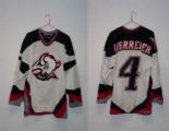 The color scheme is far better than what they've been wearing since vacating The Aud for what is now HSBC Arena, formerly the Marine Midland Arena. The jersey on the left was not-so-affectionately called the Goat's Head because, try to envision it as much as possible, it just doesn't look like a damn buffalo!
So what's wrong with the new unis? LOOK AT THEM! Two images come to mind and have been discussed ad nauseam on message boards on the World Wide Web. It's been called the Buffaslug ... which I suppose, isn't much better than wearing a goat's head on your chest.
Second, if you look closely, it looks kind of like this guy's hair...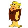
Thoughts? Comments? Discuss among yourselves.


No comments:
Post a Comment